

Imperial Ceremonial Matcha
Imperial Ceremonial Matcha
Contact our sales team for detailed specifications and application suitability.
- Grade:
- Standard
- Color:
- Varies
- Mesh Range:
- Standard
- Min. Order:
- Negotiable
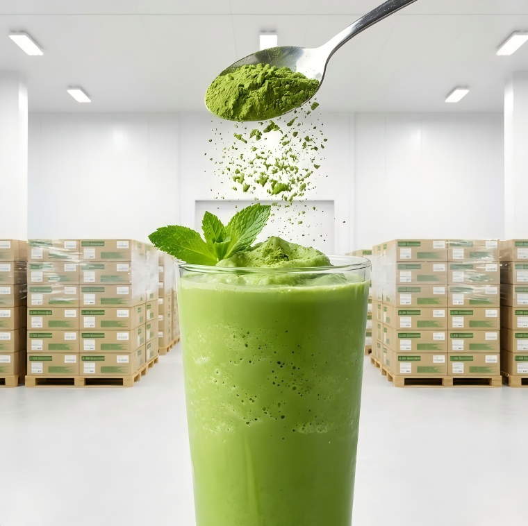
Explore products selected for bright green color performance. Buyers in this category usually compare shelf appeal, premium perception, and suitability for visually driven beverage and dessert applications.
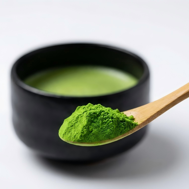
Bright Green Color refers to a stronger, cleaner, and more vivid green appearance that helps products look fresher, more premium, and more visually attractive in the final application.
In B2B sourcing, this feature matters because appearance often shapes first impression, premium positioning, and customer acceptance before flavor is fully experienced.
A brighter and more vivid green appearance often signals freshness, cleaner visual identity, and stronger display value in beverages, desserts, or retail packaging.
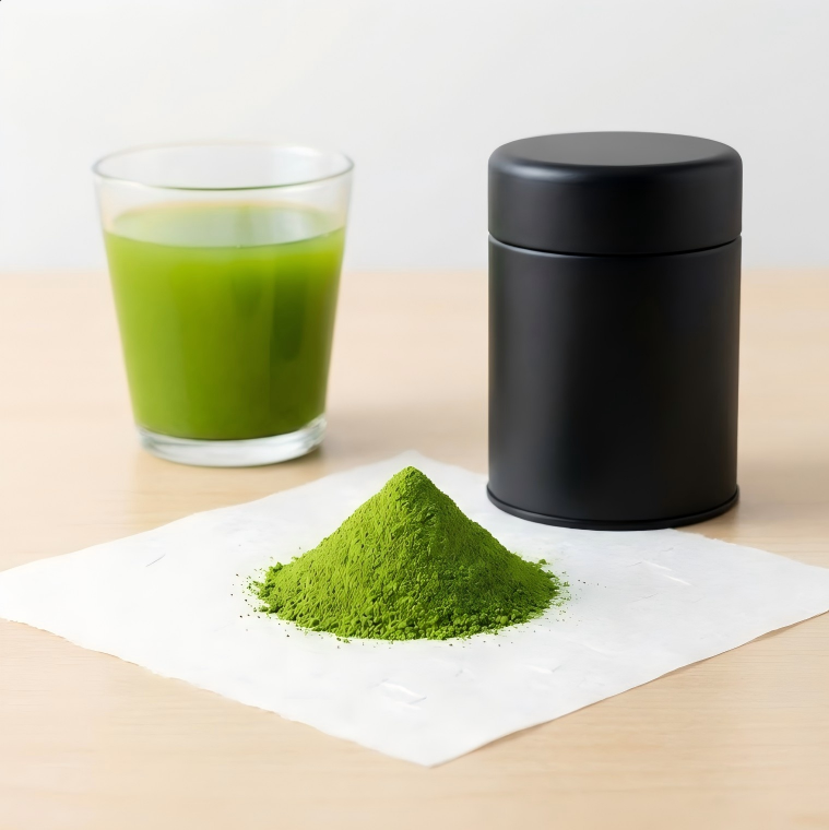
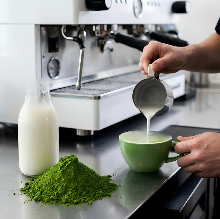
Especially relevant for matcha latte, iced drinks, RTD beverages, desserts, soft serve, powder display packs, and social-media-friendly products where color strongly affects conversion.
A strong color alone is not enough. Buyers should confirm whether the product still has good flavor balance and whether the color remains attractive after actual processing or storage.
For commercial buyers, a performance feature should be connected with real application results, not judged as a simple label.
Especially relevant for matcha latte, iced drinks, RTD beverages, desserts, soft serve, powder display packs, and social-media-friendly products where color strongly affects conversion.
Sample testing, final application trials, color check, flavor review, storage observation, and repeated batch comparison.
A strong color alone is not enough. Buyers should confirm whether the product still has good flavor balance and whether the color remains attractive after actual processing or storage.
Compare available matcha products by grade, color, mesh range, MOQ, and application performance.
Contact our sales team for detailed specifications and application suitability.
Contact our sales team for detailed specifications and application suitability.
Contact our sales team for detailed specifications and application suitability.
Contact our sales team for detailed specifications and application suitability.
Performance priorities should be compared in the context of your actual application, not as isolated labels.
Bright green color helps improve product appearance, premium perception, and visual competitiveness in many commercial categories.
Test color in your real finished format, because visual performance can change after milk mixing, ice dilution, heating, or packaging display.
Tell suppliers your target application, serving format, and whether visual brightness or long-term stability matters more for your product line.
These questions help buyers use performance features as practical sourcing standards.
No. A performance feature is not the same as grade. It describes how the product behaves in color, flavor, texture, or processing, while grade still depends on raw material, specifications, and application target.
Buyers should test samples in the real application, such as latte, RTD beverage, bakery, dessert, hot processing, or direct drinking. Dry powder appearance alone is not enough.
Yes. For OEM or bulk projects, the target feature can usually be adjusted through grade selection, blending direction, particle size, application testing, and batch control standards.
Provide your target application, required performance feature, order volume, packaging format, processing conditions, and any color, flavor, bitterness, or stability requirements.
Tell us which performance priority matters most, along with your target use, packaging format, and MOQ. We will recommend suitable options for testing and sourcing.